Making a Responsive Mobile-Ready Cognos Report

IBM has recently released a "mobile app" designed to allow users to use dashboards and ask questions to the AI assistant. It works, but what it doesn't do is allow the consumption of pixel-perfect reports.
When building a mobile-ready report, there are a few fundamental principles to adhere to. Foremost, we can't assume to know the size of the device consuming the report. Screen sizes vary greatly across multiple devices, and your report should adapt to accommodate all of them. Graphs should be relatively simple with as little "chart junk" as possible, and data tables should have as few columns as possible. And finally, I recommend getting a designer to make it look nice.
Practically speaking there are a few actions to take when consuming the reports on a mobile device. For one the reports are sitting inside an iframe that is actually set with a minimum width that is wider than most mobile device screens. Secondly, the application bar at the top is far wider than would be supported.

Any report that is called on a mobile app should be called with &ui_navbar=false&ui_appbar=false as part of the URL. This ensures the report is loaded without the navigation or application bars, making sure there is plenty of real estate specifically for the report. By removing both bars, however, it is essential that there is a method of navigation from within the report. This can be handled by drill through or defined hyperlinks in the report itself.
When we get rid of the bars and remove the width set on the parent iframe, the report can now fit into the entire screen of the mobile device.
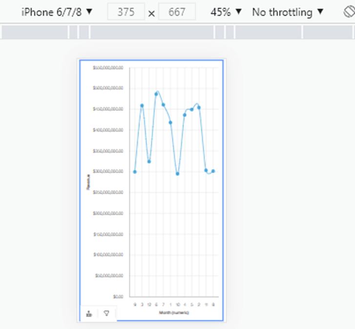
The report layout should be set up so it looks nice in both landscape and portrait modes. While building, use the browser developer toolbar to test. Press F12 to open, and then press this button:
…to simulate the desired device.
I prefer using flexbox as you can easily define breakpoints for browser widths. For example, you grow or shrink an element in steps of 300px pixels, and then have it wrap.
Finally, we need to add a prompts panel. Let’s go for a pure CSS solution here. Since this is now the future, we can use the detail element to make a quick and easy expand/collapse panel.
.https://developer.mozilla.org/en-US/docs/Web/HTML/Element/details
The custom CSS used here is not natively available through the Cognos GUI. For that matter, none of the modern CSS settings are available. Instead, we can use an HTML item. The trick is to set the name of the blocks; that name then becomes the lid attribute of the HTML element on the page.

We can use CSS selectors to select that block.
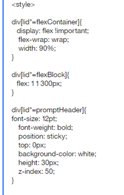
Bonus tip! You can use this technique to give blocks rounded corners, CSS animations, calculations, or all sorts of wonderful techniques to really make your reports POP on mobile browsers.
The headers for the prompt and blocks are set with position: sticky. That will keep it “sticky” to the top of the page as the user scrolls down. Set the prompt headers to 0px, and the block headers to 30px. The final output for this (relatively simple output) looks like this:
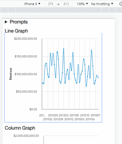
Extending this out, and using some custom controls to add more functionality can take this report:

And present it like this on a phone:
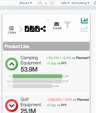
The flex layout automagically repositions the score icon and variance details above the graphs as the screen shrinks.
Conclusion
The bottom line is that if you treat Cognos as an HTML generator as opposed to a strict reporting engine, it is then possible to consider additional possibilities and use cases. In any case, a successful rollout will always involve a designer working closely with the end user of the reports to ensure the final product will both look good, and serve the needs of the user. Here is the report XML and JavaScript that I used for the simple report.
Next Steps
If your organization is looking for an extensive mobile-ready rollout of Cognos reports and need help, be sure to reach out to our PMsquare team for technical guidance and support.
We hope you found this article informative. Be sure to subscribe to our newsletter for data and analytics news, updates, and insights delivered directly to your inbox.
